


c
012
client
Olioli Poké
Olioli Poké is a Danish food and beverage restaurant chain, who opened their first store, two years ago, at Frederiksberg.
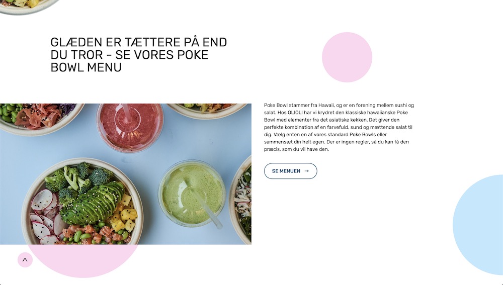
They're opening more and more stores, and recently opened a restaurant in Copenhagen Airport. They are serving fresh made juices, poké bowls, breakfast/smoothie bowls, and to-go coffee.
"Olioli" means "joy" in Hawaiian. Joy is also a keyword and -factor in their concept and growth strategy. Their goal is that the experience of Olioli will create immediate joy for the visitors/customers/guests.
— No matter what mood you’re in entering their environment, you will leave them with a smile on your face.


assignment
w
014
The Joy of People and Food
Together with the collaborator Jacob Pajor, we were assigned the task to define, design and develop a new website to their brand. Olioli Poké is Jacob Pajor's client. So h called me to get my expert Webflow developer skills, since this assignment pointed in a direction which needed Webflow's abilities to develop.
Olioli Poké has opened 5 stores since their first, and therefore developed into a more professional and corporate food and beverage company. With more stores follows more employees, and this means that Olioli Poké can express their approach to propagating a more wide and extensive culture. The main focus in this assignment is to include more of their culture into the webpage.
As you've read in the information about the client, Olioli means "joy" and that's really a huge part of the way they're working, growing and evolving. Joy is also the reason why they wanted to have a new webpage, and my collaborator(Jacob Pajor) and I, was now ready to come up with a solution for this webpage to include a joyful culture.


Coming up with a solution for this assignment with my collaborator Jacob Pajor, we needed a lean project management structure, and a simple task distribution plan. Jacob Pajor sketched the landingpages, handled creative direction and controlled all communication with the client. I developed the front-end product, signed off all design elements, and worked as an art director on the project.
Olioli Poké's keyword in their company culture needed to be our main focus in this case. Joy is a playful word, and we needed the output to be joyful, smooth, culture expressing and aligned with the company profile.
So we included the culture, the employees, the food and the stores. With this in mind, we thought that the employees is surrounding all of the keywords we was to implement. We got all employees to write "joy" on a paper, then we digitalised it, and implemented it as a playful element on the some of the pages, with all the other circles, images and elements, tapping in to their identity.
solution
c
012
/
w
014
Coming up with a solution for this assignment with my collaborator Jacob Pajor, we needed a lean project management structure, and a simple task distribution plan. Jacob Pajor sketched the landingpages, handled creative direction and controlled all communication with the client. I developed the front-end product, signed off all design elements, and worked as an art director on the project.
Olioli Poké's keyword in their company culture needed to be our main focus in this case. Joy is a playful word, and we needed the output to be joyful, smooth, culture expressing and aligned with the company profile.
So we included the culture, the employees, the food and the stores. With this in mind, we thought that the employees is surrounding all of the keywords we was to implement. We got all employees to write "joy" on a paper, then we digitalised it, and implemented it as a playful element on the some of the pages, with all the other circles, images and elements, tapping in to their identity.


